If you want to craft a delightful marketing experience and you’re using popups, you need to make sure you hold them to the same high standards as the content they are covering up. You can learn a lot by looking at bad website popup examples.
Once you understand what not to do, you’ll default to starting your own popup designs from a better baseline.
What does a bad popup design actually look like?
Well, it depends on your judging criteria, and for the popup examples below, I was considering these seven things, among others:
- Clarity: Is it easy to figure out the offer really quickly?
- Relevance: Is it related to the content of the current page?
- Manipulation: Does it use psychological trickery in the copy?
- Design: Is it butt ugly?
- Control: Is it clear what all options will do?
- Escape: Can you get rid of it easily?
- Value: Is the reward worth more than the perceived (or actual) effort?
The following popup examples, each make a number of critical errors in their design decisions. Take a look, and share your own worst popup design examples in the comments!
#1 – Mashable Shmashable
What’s so bad about it?
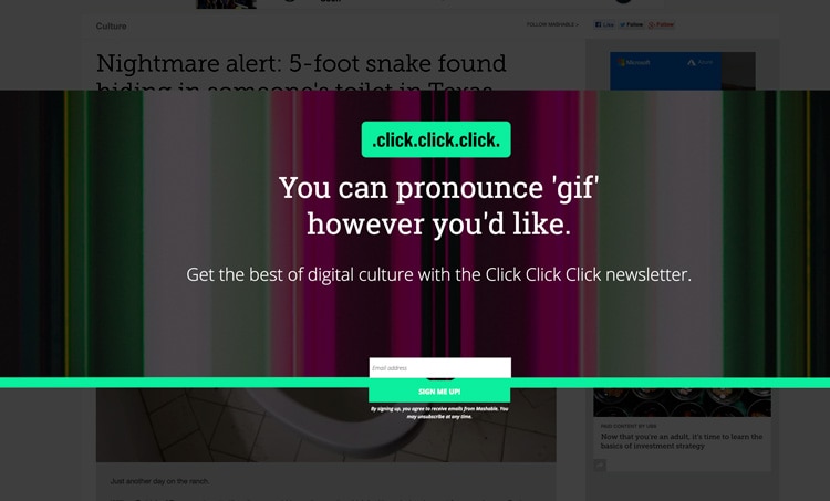
If you peer into the background behind the popup, you’ll see a news story headline that begins with “Nightmare Alert”. I think that’s a pretty accurate description of what’s happening here.
- Design: Bad. The first thing I saw looks like a big mistake. The Green line with the button hanging off the bottom looks like the designer fell asleep with their head on the mouse.
- Clarity: Bad. And what on earth does the headline mean? click.click.click. Upon deeper exploration, it’s the name of the newsletter, but that’s not apparent at all on first load.
- Clarity: worse. Then we get the classic “Clear vs. Clever” headline treatment. Why are you talking about the pronunciation of the word “Gif”? Tell me what this is, and why I should care to give you my email.
- Design: Bad. Also, that background is gnarly.
#2 – KAM Motorsports Revolution!
What’s so bad about it?
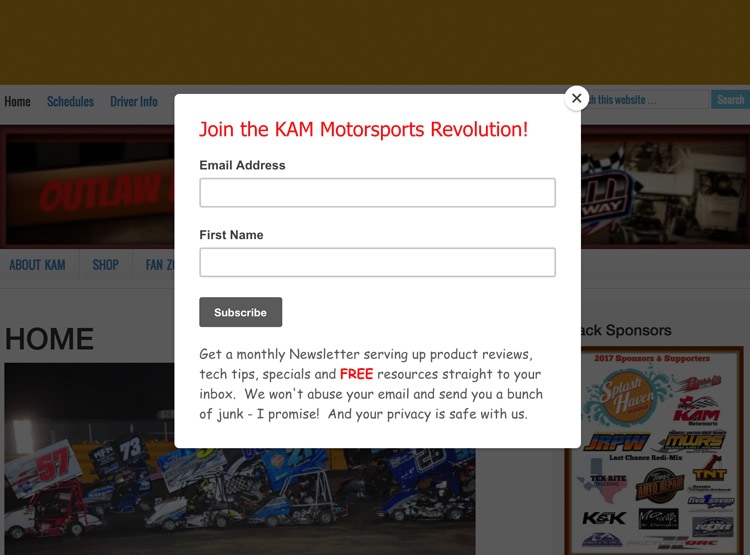
It’s motorsports. It’s not a revolution. Unless they’re talking about wheels going round in circles.
- Clarity: Bad. The headline doesn’t say what it is, or what I’ll get by subscribing. I have to read the fine print to figure that out.
- Copy: Bad. Just reading the phrase “abuse your email” is a big turn off. Just like the word spam, I wasn’t thinking that you were going to abuse me, but now it’s on my mind.
- Relevance: Bad. Newsletter subscription popups are great, they have a strong sense of utility and can give people exactly what they want. But I don’t like them as entry popups. They’re much better when they use an exit trigger, or a scroll trigger. Using a “Scroll Up” trigger is smart because it means they’ve read some of your content, and they are scrolling back up vs. leaving directly, which is another micro-signal that they are interested.
#3 – Utterly Confused
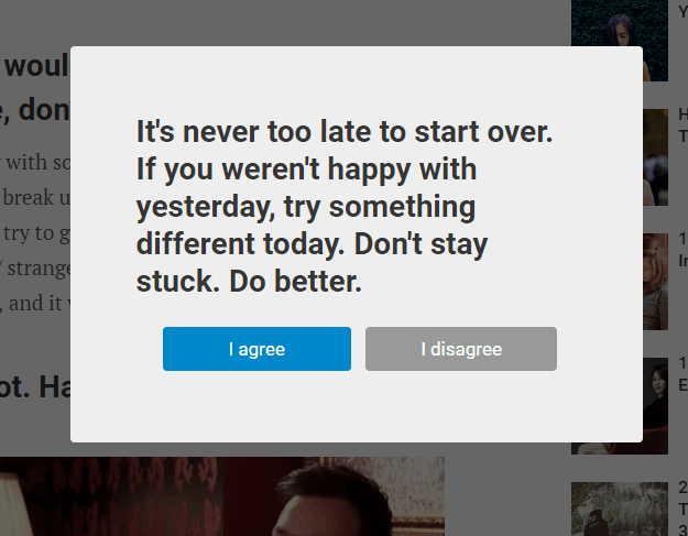
(Source unknown – I found it on confirmshaming.tumblr.com)
What’s so bad about it?
I have no earthly clue what’s going on here.
- Clarity: Bad. I had to re-read it five times before I figured out what was going on.
- Control: Bad. After reading it, I didn’t know whether I would be agreeing with what they’re going to give me, or with the statement. It’s like an affirmation or something. But I have no way of knowing what will happen if I click either button. My best guess after spending this much time writing about it is that it’s a poll. But a really meaningless one if it is. Click here to find out how many people agreed with “doing better”…
- It ends with “Do Better”. I agree. They need to do a lot better.
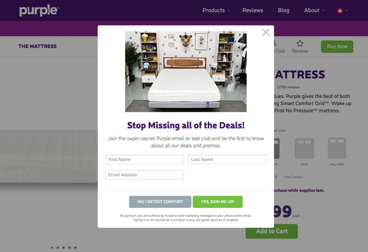
#4 – Purple Nurple
What’s so bad about it?
- Manipulation: Bad. Our first “Confirm Shaming” example. Otherwise known as “Good Cop / Bad Cop”. Forcing people to click a button that says “Detest” on it is so incongruent with the concept of a mattress company that I think they’re just being cheap. There’s no need to speak to people that way.
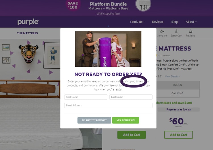
- I found a second popup example by Purple (below), and have to give them credit. The copy on this one is significantly more persuasive. Get this. If you look at the section I circled (in purple), it says that if you subscribe, they’ll keep you up to date with SHIPPING TIMES!!! Seriously? If you’re going to email me and say “Hey Oli, great news! We can ship you a mattress in 2 weeks!”, I’ll go to Leesa, or Endy, or one of a million other Casper copycats.
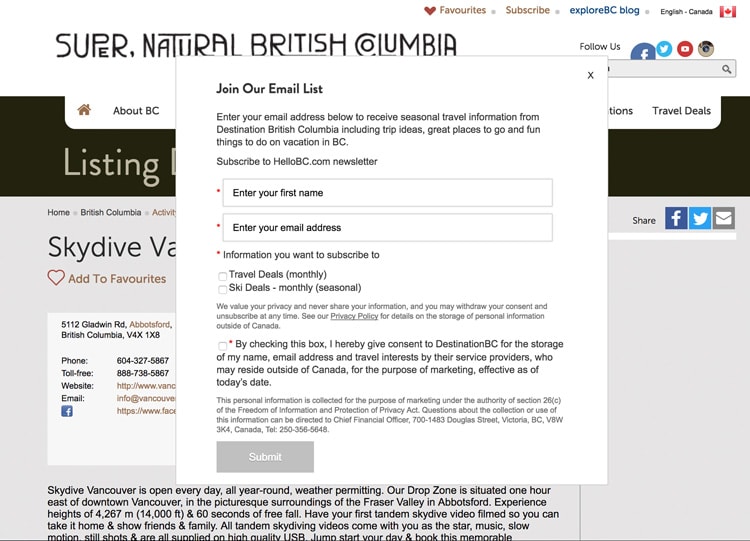
#5 – Hello BC
What’s so bad about it?
Context: This is an entry popup, and I have never been to this site before.
- Relevance: Bad. The site is Hellobc.com, the title says “Supernatural British Columbia”, and the content on the page is about skydiving. So what list is this for? And nobody wants to be on a “list”, stop saying “list”. It’s like saying email blast. Blast your list. If you read the first sentence it gets even more confusing, as you’ll be receiving updates from Destination BC. That’s 4 different concepts at play here.
- Design: Bad. It’s legitimately butt ugly. I mean, come on. This is for Beautiful Supernatural British Columbia ffs. It’s stunning here. Show some scenery to entice me in.
- Value: Bad. Seeing that form when I arrive on the page is like a giant eff you. Why do they think it’s okay to ask for that much info, with that much text, before I’ve even seen any content?
- Control: Bad. And there’s not any error handling. However, the submit button remains inactive until you magically click the right amount of options to trigger it’s hungry hungry hippo mouth to open.
Train. Wreck.
Well, that’s all for today, folks. You might be wondering why there were so few popup examples in this post. Honestly, when the team was rallying to find me a bunch of examples, we all struggled to find many truly awful ones. We also struggled to find many really awesome ones.
This is where YOU come in!
Send me your terrible and awesome popup examples!
If you have any wonderfully brutal, or brutally wonderful examples of website popup design, I’d really appreciate a URL in the comments. If you could share the trigger details too that would be rad (e.g. exit, entrance, scroll, delay etc.).
Tomorrow’s Post is about Awesome Popup Examples! YAY.
So get your butt back here same time tomorrow, where I’ll be sharing my brand new Popup Delight Equation that you can use to grade your own popup designs.
Cheers,
Oli
p.s. Don’t forget to subscribe to the weekly updates.
5 Really Bad Website Popup Examples posted first on https://nickpontemrktg.wordpress.com/
No comments:
Post a Comment