 It’s Day 5 of Product Marketing Month. Today I get to bash some really bad popup examples. Yuss! — Unbounce co-founder Oli Gardner
But before I bring the heat, I want to talk a bit about what it’s like, as a product marketer, to be marketing something that’s difficult to market.
You see, there’s a common problem that many marketers face, and it’s also one of the most asked questions I hear when I’m on the road, as a speaker:
“How do I great marketing for a boring product or service?”
That’s a tough challenge for sure, although the good news is that if you can inject some originality you’ll be a clear winner, as all of your competitors are also boring. However, I think I can one-up that problem:
“How do I do great marketing for something that’s universally hated, like popups?”
We knew we had a big challenge ahead of us when we decided to release the popups product because of the long legacy of manipulative abuse it carries with it.
In fact, as the discussion about product direction began in the office, there were some visceral (negative) reactions from some folks on the engineering team. They feared that we were switching over to the dark side.
It makes sense to me that this sentiment would come from developers. In my experience, really good software developers have one thing in common. They want to make a difference in the world. Developers are makers by design, and part of building something is wanting it to have a positive impact on those who use it.
To quell those types of fears requires a few things;
- Education about the positive use cases for the technology,
- Evidence in the form of good popup examples, showcasing how to use them in a delightful and responsible manner,
- Features such as advanced triggers & targeting to empower marketers to deliver greater relevance to visitors,
- And most important of all – it requires us to take a stance. We can’t change the past unless we lead by example.
It’s been my goal since we started down this path, to make it clear that we are drawing a line in the sand between the negative past, and a positive future.
Which is why we initially launched with the name “Overlays” instead of popups.
Overlays vs. Popups – The End of an Era
It made a lot of sense at the time, from a branding perspective. Through podcast interviews and public speaking gigs, I was trying to change the narrative around popups. Whenever I was talking about a bad experience, I would call it a popup. When it was a positive (and additive) experience, I’d call it an overlay. It was a really good way to create a clear separation.
I even started to notice more and more people calling them overlays. Progress.
Unfortunately, it would still require a lot of continued education to make a dent in the global perception of the terminology, that with the search volume for “overlays” being tiny compared to popups, factored heavily into our decision to pivot back to calling a popup a popup.
Positioning is part of a product marketer’s job – our VP of Product Marketing, Ryan Engley recently completed our most recent positioning document for the new products. Just as the umbrella term “Convertables” we had been using to include popups and sticky bars had created confusion, “Overlays” was again making the job harder than it should have been. You can tell, just from reading this paragraph alone that it’s a complex problem, and we’re moving in the right direction by re-simplifying.
The biggest challenge developing our positioning was the number of important strategic questions that we needed to answer first. The market problems we solve, for who, how our product fits today with our vision for the future, who we see ourselves competing with, whether we position ourselves as a comprehensive platform that solves a unique problem, or whether we go to market with individual products and tools etc. It’s a beast of an undertaking.
My biggest lightbulb moment was working with April Dunford who pushed me to get away from competing tool-to-tool with other products. She said in order to win that way, you’d have to be market leading in every tool, and that won’t happen. So what’s the unique value that only you offer and why is it important?
— Ryan Engley, VP Product Marketing at Unbounce
You can read more about our initial product adoption woes, and how our naming conventions hurt us, in the first post in the series – Product Marketing Month: Why I’m Writing 30 Blog Posts in 30 Days.
Let’s get back to the subject of popups. I think it’s important to look back at the history of this device to better understand how they came about, and why they have always caused such a stir.
Browser Interaction Models & the History of the Popup
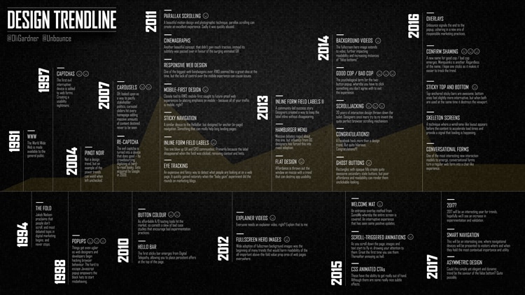
The talk I was doing much of last year was called Data-Driven Design. As part of the talk, I get into interaction design trends. I’ve included the “Trendline” slide below.
You can see that the first occurrence of a popup was back in 1998. Also, note that I included Overlays in late 2016 when we first started that discussion.
Like many bad trends, popups began as web developers started trying to hack browser behavior to create different interruptive interaction modes. I know I made a lot of them back in the day, but I was always doing it to try to create a cool experience. For example, I was building a company Intranet and wanted to open up content in a new window, resize it, and stick it to the side of the screen as a sidebar navigation for the main window. That was all good stuff.
Tabbed browsers have done a lot to help clean up the mess of multiple windows, and if you couple that with popup blockers, there’s a clear evolution in how this type of behavior is being dealt with.
Then came the pop-under, often connected to Malware virus schemes where malicious scripts could be running in the background and you wouldn’t even know.
And then the always fun “Are you sure you want to do that?” Inception-like looping exit dialogs.
Developers/hackers took the simple Javascript modal “Ok” “Cancel” and abused it to the point where there was no real way out of the page. If you tried to leave the page one modal would lead to another, and another, and you couldn’t actually close the browser window/tab unless you could do it within the split second between one dialog closing and the next opening. It was awful.
So we have a legacy of abuse that’s killed the perception of popups.
What if Popups Had Been Built Into Browsers?
Imagine for a moment that a popup was simply one of many available interaction models available in the browsing experience. They could have had a specification from the W3C, with a set of acceptable criteria for display modes. It would be an entirely different experience. Sure, there would still be abuse, but it’s an interesting thought.
This is why it’s important that we (Unbounce and other like-minded marketers and Martech software providers) take a stance, and build the right functionality into this type of tool so that it can be used responsibly.
Furthermore, we need to keep the dialog going, to educate the current and future generations of marketers that to be original, be delightful, be a business that represents themselves as professionals, means taking responsibility for our actions and doing everything we can to take the high road in our marketing.
Alright, before I get to the really bad website popup examples, I’ll leave you with this thought:
Technology is NOT the problem, We Are.
It’s the disrespectful and irresponsible marketers who use manipulative pop-psychology tactics for the sake of a few more leads, who are the problem. We need to stop blaming popups for bad experiences, and instead, call out the malicious marketers who are ruining it for those trying to do good work.
It’s a tough challenge to reverse years of negative perception, but that’s okay. It’s okay because we know the value the product brings to our customers, how much extra success they’re having, and because we’ve built a solution that can be configured in precise ways that make it simple to use in a responsible manner (if you’re a good person).
Follow our Product Marketing Month journey >> click here to launch a popup with a subscribe form (it uses our on-click trigger feature).
5 Really Bad Website Popup Examples
What does a bad popup actually look like? Well, it depends on your judging criteria, and for the examples below, I was considering these seven things, among others:
- Clarity: Is it easy to figure out the offer really quickly?
- Relevance: Is it related to the content of the current page?
- Manipulation: Does it use psychological trickery in the copy?
- Design: Is it butt ugly?
- Control: Is it clear what all options will do?
- Escape: Can you get rid of it easily?
- Value: Is the reward worth more than the perceived (or actual) effort?
#1 – Mashable Shmashable
What’s so bad about it?
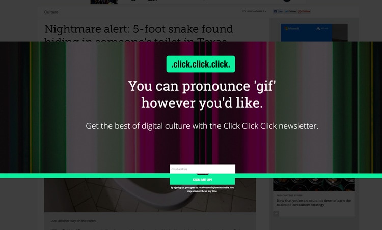
If you peer into the background behind the popup, you’ll see a news story headline that begins with “Nightmare Alert”. I think that’s a pretty accurate description of what’s happening here.
- Design: Bad. The first thing I saw looks like a big mistake. The Green line with the button hanging off the bottom looks like the designer fell asleep with their head on the mouse.
- Clarity: Bad. And what on earth does the headline mean? click.click.click. Upon deeper exploration, it’s the name of the newsletter, but that’s not apparent at all on first load.
- Clarity: worse. Then we get the classic “Clear vs. Clever” headline treatment. Why are you talking about the pronunciation of the word “Gif”? Tell me what this is, and why I should care to give you my email.
- Design: Bad. Also, that background is gnarly.
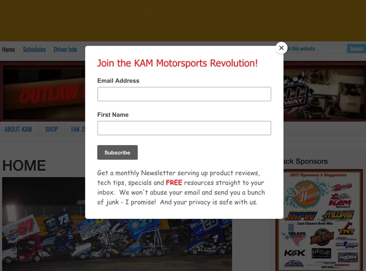
#2 – KAM Motorsports Revolution!
What’s so bad about it?
It’s motorsports. It’s not a revolution. Unless they’re talking about wheels going round in circles.
- Clarity: Bad. The headline doesn’t say what it is, or what I’ll get by subscribing. I have to read the fine print to figure that out.
- Copy: Bad. Just reading the phrase “abuse your email” is a big turn off. Just like the word spam, I wasn’t thinking that you were going to abuse me, but now it’s on my mind.
- Relevance: Bad. Newsletter subscription popups are great, they have a strong sense of utility and can give people exactly what they want. But I don’t like them as entry popups. They’re much better when they use an exit trigger, or a scroll trigger. Using a “Scroll Up” trigger is smart because it means they’ve read some of your content, and they are scrolling back up vs. leaving directly, which is another micro-signal that they are interested.
#3 – Utterly Confused
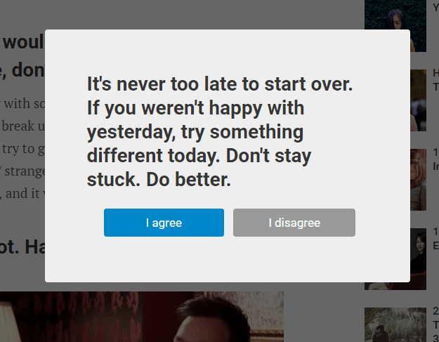
(Source unknown – I found it on confirmshaming.tumblr.com)
What’s so bad about it?
I have no earthly clue what’s going on here.
- Clarity: Bad. I had to re-read it five times before I figured out what was going on.
- Control: Bad. After reading it, I didn’t know whether I would be agreeing with what they’re going to give me, or with the statement. It’s like an affirmation or something. But I have no way of knowing what will happen if I click either button. My best guess after spending this much time writing about it is that it’s a poll. But a really meaningless one if it is. Click here to find out how many people agreed with “doing better”…
- It ends with “Do Better”. I agree. They need to do a lot better.
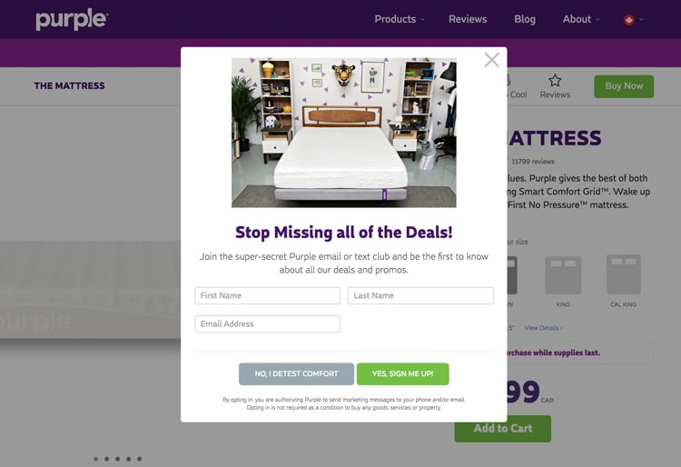
#4 – Purple Nurple
What’s so bad about it?
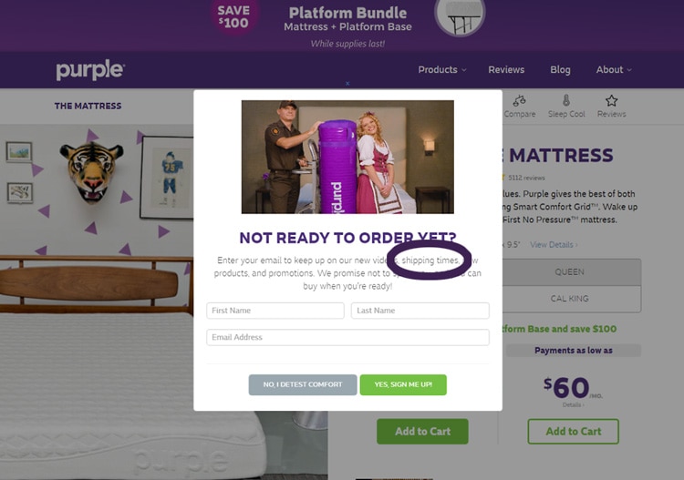
- Manipulation: Bad. Our first “Confirm Shaming” example. Otherwise known as “Good Cop / Bad Cop”. Forcing people to click a button that says “Detest” on it is so incongruent with the concept of a mattress company that I think they’re just being cheap. There’s no need to speak to people that way.
- I found a second popup example by Purple (below), and have to give them credit. The copy on this one is significantly more persuasive. Get this. If you look at the section I circled (in purple), it says that if you subscribe, they’ll keep you up to date with SHIPPING TIMES!!! Seriously? If you’re going to email me and say “Hey Oli, great news! We can ship you a mattress in 2 weeks!”, I’ll go to Leesa, or Endy, or one of a million other Casper copycats.
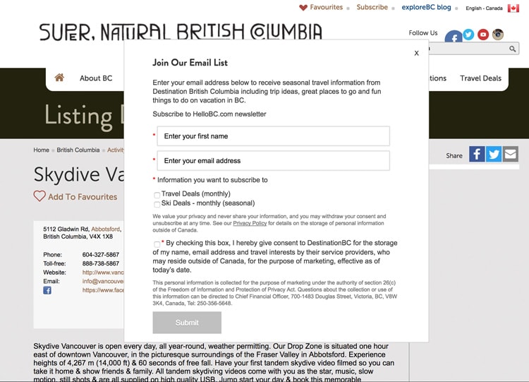
#5 – Hello BC
What’s so bad about it?
Context: This is an entry popup, and I have never been to this site before.
- Relevance: Bad. The site is Hellobc.com, the title says “Supernatural British Columbia”, and the content on the page is about skydiving. So what list is this for? And nobody wants to be on a “list”, stop saying “list”. It’s like saying email blast. Blast your list. If you read the first sentence it gets even more confusing, as you’ll be receiving updates from Destination BC. That’s 4 different concepts at play here.
- Design: Bad. It’s legitimately butt ugly. I mean, come on. This is for Beautiful Supernatural British Columbia ffs. It’s stunning here. Show some scenery to entice me in.
- Value: Bad. Seeing that form when I arrive on the page is like a giant eff you. Why do they think it’s okay to ask for that much info, with that much text.
- Control: Bad. And there’s not any error handling. However, the submit button remains inactive until you magically click the right amount of options to trigger it’s hungry hungry hippo mouth to open.
Trainwreck.
Well, that’s all for today, folks. You might be wondering why there were so few popup examples in this post, keep reading and I’ll explain why.
Coming Up Tomorrow – Good Popups, YAY!!!
One of the most interesting things I’ve noticed of late is that there is a shift in quality happening in the popup world. When the team rallied to find the bad popup examples above, we found at least 10x as many good ones as bad. That’s something to feel pretty good about. Perhaps the positive energy we’re helping to spread is having an impact.
So get your butt back here tomorrow to see 20+ delightful website popup examples. More importantly, I’ll also be sharing “The Delight Equation”, my latest formula for measuring quantifying how good your popups really are.
See you then!
Cheers
Oli
p.s. Don’t forget to subscribe to the weekly updates.
Technology isn’t the Problem, We Are: 5 Horrific Website Popup Examples posted first on https://nickpontemrktg.wordpress.com/
No comments:
Post a Comment